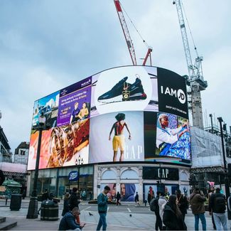
Ads in Piccadilly Circus
Photo by Tânia Mousinho on Unsplash
Simply The Best: Adland Picks Its Favourite Out Of Home Campaigns
Industry experts reveal their favourite OOH work
06 October 2025
Off the back of celebrating the medium of out-of-home (OOH), we asked the industry about their favourite campaigns that they didn't work on. With standout work from brands such as Ikea, Silk Cut, and The Economist, relive some classic ads from over the years.
Alex Grieve, Global and London CCO, BBH
I’ve actually got three.
The first one has to be the ‘Silk Cut’ campaign from Saatchi & Saatchi. It’s absolutely iconic. The level of craft in those ads, the simplicity, the disruptive nature - they really stood out. They were running when I first joined the industry. I actually joined Saatchi when Paul Arden was authoring them. The calibre of photographers they brought in, and the time and care that went into producing those images, was extraordinary to witness.
The second is a campaign for Stella Artois - ‘Reassuringly Expensive’ - they featured these beautiful, iconic design objects. There’s one where a classic designer chair has been used to open a bottle so it’s got scrape marks down the side. Another shows a speaker with a similar treatment. Visually, they’re just stunning - disruptive in a really subtle way. Then you get that line, 'Reassuringly Expensive' - it’s a chef’s kiss.
And the last one, because I’m a copywriter and I’ve always loved the power of words, has to be ‘The Economist’ campaign by AMV BBDO. It’s an incredible body of work. What I love most is how it evolved over time. It started with just headlines, then they introduced visuals, then began playing with the colour palette. That evolution - the ability for a great campaign to grow and stay fresh year after year - is something I really admire.
Felipe Serradourada Guimaraes, ECD, BBH London
I really love the latest Instagram work. As much as it pains me to say it, Uncommon really did something there. Jealous. And that’s when you know a piece of work is really great. When you wish you’d done it.
Sue Frogley, CEO, Talon
One that’s always stuck with me, though there are plenty of great examples, is the CoppaFeel! campaign from a few years ago. It encouraged young people to get to know their bodies and spot the signs of breast cancer early, which is such an important message.
The OOH was a brilliant mural in a busy part of East London. It was bold, colourful, and celebrated all kinds of bodies, different shapes, sizes, and genders, all in one huge, joyful painting. You couldn’t miss it and it made you stop, look up, and think.
I believe they even included a QR code that linked to a tool teaching people how to check their chest, which was such a smart, practical touch. The creative was spot-on, the placement was perfect, and the message couldn’t have been clearer. It was a great use of OOH.
Zoe Nash, Creative, adam&eveDDB London
I’ve always loved the Araldite super glue ad, the one where they stuck a car to a billboard. So simple. So effective.
Chris Lapham, creative director, Grey London
Burger King’s ‘The Mouldy Whopper’. I’ve always loved work that flips something negative on its head – like we did with Stella. It takes a brave client to sign off on something like that, which is why it’s so rare. But when it lands, it really lands. The Mouldy Whopper was disruptive, funny, bold – and smart. The pure cheek of it gets me every time.
Aaron McGurk, creative director, Grey London
Recently, I’d say Tecate’s ‘Gulf of Mexico Bar’. It was a gutsy move – sticking a floating bar in the sea as a direct response to Trump trying to rename the Gulf of Mexico as the Gulf of America. It was sharp, provocative, and a great example of how OOH can go beyond billboards. Sometimes it’s a poster, sometimes it’s a boat. It’s such a versatile medium.


