Au natural, nostalgia and expressive typography: the design trends for 2024
Becci Salmon, design director at FCB and a judge in the design and industry craft category at this year's Dubai Lynx, explores the design trends that will shape 2024
Resurgence of the gradient
After a good few years of flat colour being king of design, we could be in for gradients returning in a big way. After being bombarded with über cool super flat coloured design and rebrands, I’m starting to get fatigue. When I see gradients used in an effective way, they all of a sudden feel pretty fresh. I expect we’ll see a lot more this year.
Nostalgia, baby
It’s no secret that 90’s and 00’s nostalgia has come back in a big way in recent years. Not just in graphic design but in fashion too – one feeds into the other. This year I can already see us moving even further back to the warm and fuzzy 70’s nostalgia: considered typography, serifs full of character, and photography that feels manual. It feels evocative and full of personality – something that I think we’re all craving in the flat digital world we’ve become accustomed to.
Expressive typography
This one’s been brewing a while – with the unveiling of Wolff Olin’s new logo last year and rebrands like Le Shuttle (Eurotunnel) it’s clear that typography, when crafted, can communicate far more than just words. It can communicate a mood, a product, a service, a feeling – anything, really. Monotype’s type trends report describes this as Quirk – “a willingness to try something unexpected, to stand out, to speak differently”. The report is mega interesting, you should give it a read.
Au Natural
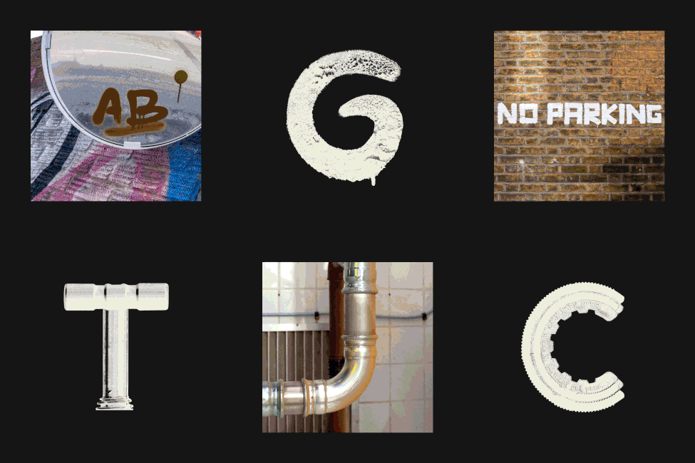
David Attenborough said, “It seems to me that the natural world is the greatest source of excitement; the greatest source of visual beauty; the greatest source of intellectual interest. It is the greatest source of so much in life that makes life worth living.” And he’s right. We are so drawn to things that feel innately hand crafted, with natural variety and imperfections – leaning on inspiration from our environment. Whether that’s interesting textures, shapes or mark making, ditching digital and connecting with our surroundings (at least as a first port of call) feels new and exciting. One example of this that I reference again and again is ‘East London Display’, a typeface created for East London Liquor Co by Ragged Edge which took letter forms from the surroundings and process of the distillery.
I by no means hold the crystal ball to all things design, but I’d be surprised if we didn’t see at least a hint of all these trends pop up over the coming year. I also can’t wait to see if we have another ‘Barbie’ moment that becomes a zeitgeist for the year, influencing all parts of culture quite unexpectedly. There’s only one way to find out … here’s to a visually exciting 2024.
Becci Salmon is the design director at FCB London and was on the design and industry craft jury at this year's Dubai Lynx


