air up’s Playful Rebrand Strengthens It's Position As A Lifestyle Brand
Created by Mother Design, air up's rebrand promotes its scent powered water bottle to both adults and children alike
07 June 2024
Independent branding and design studio Mother Design has unveiled air up’s first rebrand since its original launch in 2019, as it seeks to bolster its position as a beverage industry leader answering new consumer needs, and drive global expansion.
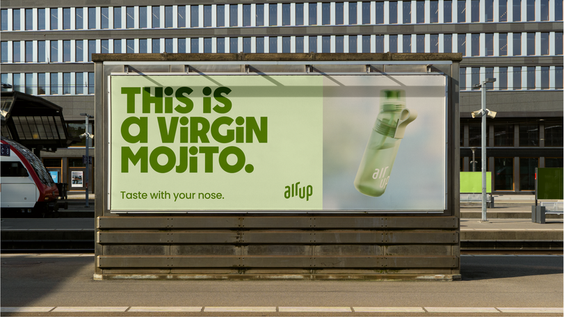
The brand’s unique Scentaste proposition - flavour through scent - means that when you drink from an air up bottle, your brain perceives flavour, but you are drinking water, with all the natural flavours you crave but without sugar or additives.
With the business growing rapidly, air up identified a need for a brand that would grow with it. Mother Design has developed a new identity to elevate and change perceptions of air up, to further position it as an aspirational lifestyle brand, as it continues to expand globally and further boost penetration in active markets.
The new strategy is anchored in the universal human tension between our two selves: our adult-self, which leans into responsibility and control, and our inner-child which craves play and freedom.
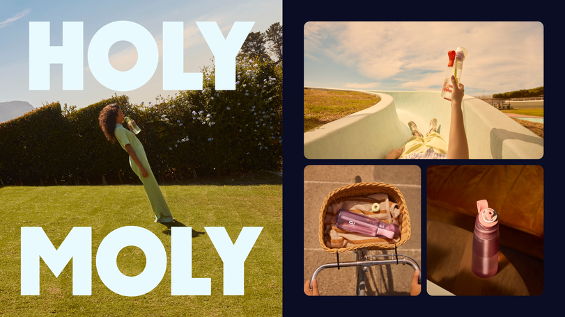
The new identity, developed for air up by Mother Design, aims to engage with a wide range of audiences. From kids and their parents seeking to establish healthy consumption habits at an early age, to adults looking for solutions to maintain a healthy lifestyle without sacrificing pleasure.
Toma Perret, head of global brand strategy, air up, said: “Creating a new category is not an everyday challenge. Bringing new ideas, concepts and experiences to life and markets needs profound dedication. We are pleased to have found in Mother Design not only talented creative professionals but also strong leaders, eager to understand business objectives and brand strategies to translate them into tangible and engaging experiences – through solid processes, dialogue and close collaboration. We believe the new identity will be one of the cornerstones of our future successes.”
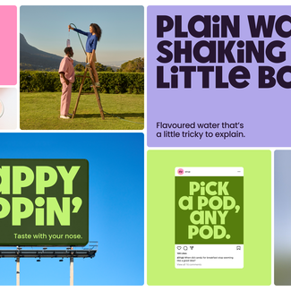
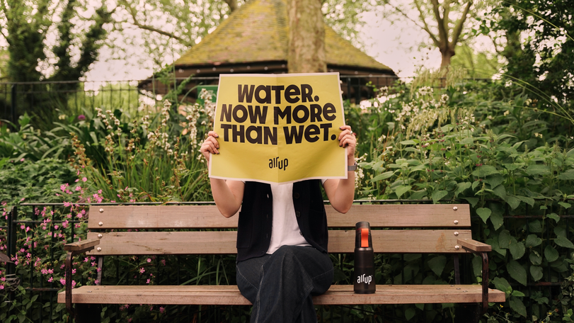
The tension between our two selves is seen throughout the new brand identity, with its playful custom typeface, air up sans, and a pared-back secondary typeface. A vibrant colour palette, reflecting the variety of air up flavours, is grounded in subtle gradients and an orderly grid. The more muted colours of the art direction are bolstered with a touch of whimsy in the styling and scenarios. The new brand has a playful, joyful tone of voice, brought to life with fluid, expressive motion.
Nima Akbari, brand creative director, air up, added “Every great project starts with a proper strategy and a great brief. The results of this work with Mother Design are a testament to that. The design is a marriage between the playfulness of the inner-child in typography and colours, in combination with a very put-together adult-like strictness in the totality of the design system.”
To visualise the concept of taste experienced through smell, and the range of flavours that are captured with the interchangeable air up pods, Mother Design used generative technology software. The studio harnessed 3D design tools such as Nomad Sculpt and Spline to work towards a tangible visual language that served to reflect a totally new sensory experience.
Mother Design refined the existing air up logo to increase clarity and improve impact, as it was important to retain a familiar symbol that the audience has come to know and love, while maintaining attribution amid a widely reimagined visual language.
The new platform has been designed to roll out across all print and digital surfaces, including advertising, products, packaging, livery, and on social and digital channels.
Harry Edmonds, creative director, Mother Design, concluded: “The new air up brand identity is a celebration of the interplay between the responsibilities of adulthood and the boundless freedom of our inner child. By blending bold, expressive elements with a touch of whimsy, we’ve created a vibrant and engaging experience that speaks to both sides of our audience. Harnessing cutting-edge design tools and generative technology, we've pushed the boundaries to visually represent the concept of ‘taste experienced through scent’ in a tangible way."
Credits
Client - air up
Brand Creative Director, air up :Nima Akbari
Head of Global Brand Strategy, air up:Toma Perret
Senior Brand Campaign Manager, air up:Georgios Charissis
Branding and design studio - Mother Design
Creative Director, Mother Design: Harry Edmonds
Design Director, Mother Design: Issey Conway
Designer, Mother Design: Ethan Hodson
Designer, Mother Design: Jiwoo Kim
Client Services Director, Mother Design: Annabel Engels
Project Director, Mother Design: Anna Victor
Senior Strategist, Mother Design: Sophie Stucke
Copy Director, Mother Design: Sarah Grech
Motion Director, Mother Design: Ian Acton
Brand Photography – air up x Melissa Schriek
Photographer: Melissa Schriek
Type Design - Hot Type
Type Designer: Marko Hrastovec


